At the moment the width #main-outlet is limited to 1100px or something.
Could it be extended (or relaxed ?).
I have an ultra wide monitor and yet, when looking at this question CIS 194 | Help on non-exhaustive pattern - Learn - Haskell Community I can only see half of the code without scrolling, yet my screen is three time the width of the “used” space.
I like that the lines are not too long here, so I’m not too keen on just making the content wider.
I’ve now reformatted the code to fit in the 75 columns that are visible on each line here on Discourse. That is another solution to this problem: better moderation.
I understand, but would not it be better that the width adapts to browser window width, so that individual people can chose what suit them ?
Resizing the browser window is generally not a trivial thing to do. For example I’d still want my window centered horizontally, but then I’d have to do that manually every time I open this website. And not all websites need to have the same width, e.g. sites may have sidebars of different widths or tiles that fill up the whole screen horizontally. So then I’d have to open separate browser windows for each site and manually resize them to my preferred width and when I restart my browser I can start all over again. I think that is not a good UX.
Could it be an option in Preferences? 
I’m not asking you to resize your windows, just to extend the width for Ultra wide display (unless of course you are also using a ultra wide display, with an ultra wide browser window).
Various browsers support user modification of CSS (often via plugins – I think Greasemonkey for Firefox may be one such). That might be easier than getting mods to change the CSS for everyone.
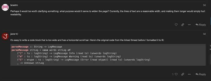
Perhaps it would be worth clarifying something: what purpose would it serve to widen the page? Currently, the lines of text are a reasonable width, and making them longer would simply hurt readability.
It’s easy to write a code block that is too wide and has a horizontal scroll bar. Here’s the original code from the linked thread before I formatted it to fit:
parseMessage :: String -> LogMessage
parseMessage strLog = case words strLog of
    ("I" : ts : logString) -> LogMessage Info (read ts) (unwords logString)
    ("W" : ts : logString) -> LogMessage Warning (read ts) (unwords logString)
    ("E" : etype : ts : logString) -> LogMessage (Error (read etype)) (read ts) (unwords logString)
    _ -> Unknown strLog
If I am the only with this issue, yes of course.
I believe Greasemonkey is more for custom JS than custom CSS. If you only want to modify CSS then an extension like Stylus seems like a better option.
It seems it is also possible to install additional themes and make them available for users to enable. Some details at Beginner's guide to using Discourse Themes - admins - Discourse Meta. It seems there are some user-maintained themes that take various stabs at the full-width. Further, it appears to be possible to implement theme components, such that an existing theme (or a duplicate thereof) can be extended in a less extreme fashion. To the point of the thread, there’s GitHub - discourse/discourse-full-width-component: Make Discourse occupy the full browser width, which could be made available on duplicates of the existing themes if desired. The userstyles archive at https://uso.kkx.one/ doesn’t seem to turn up much off-the-shelf for wide format Discourse, sadly, and it looks like the default theme CSS is a bit vexing to modify. You can get to something manageable if a bit ugly with something like
.wrap {
  max-width: 80vw;
}
.topic-post article .row {
  grid-template-areas: "avatar post-body";
  grid-template-columns: 1fr 8fr;
  display: grid;
  align-items: start;
  justify-items: center;
}

.topic-post article .row .topic-avatar {
  grid-area: avatar-start;
}

.topic-post article .row .topic-body {
  grid-area: post-body-start;
  width: 80vw;
}
Results:
Having “wide light” and “wide dark” themes would be a really good idea indeed.

