I’m enjoying this so far!
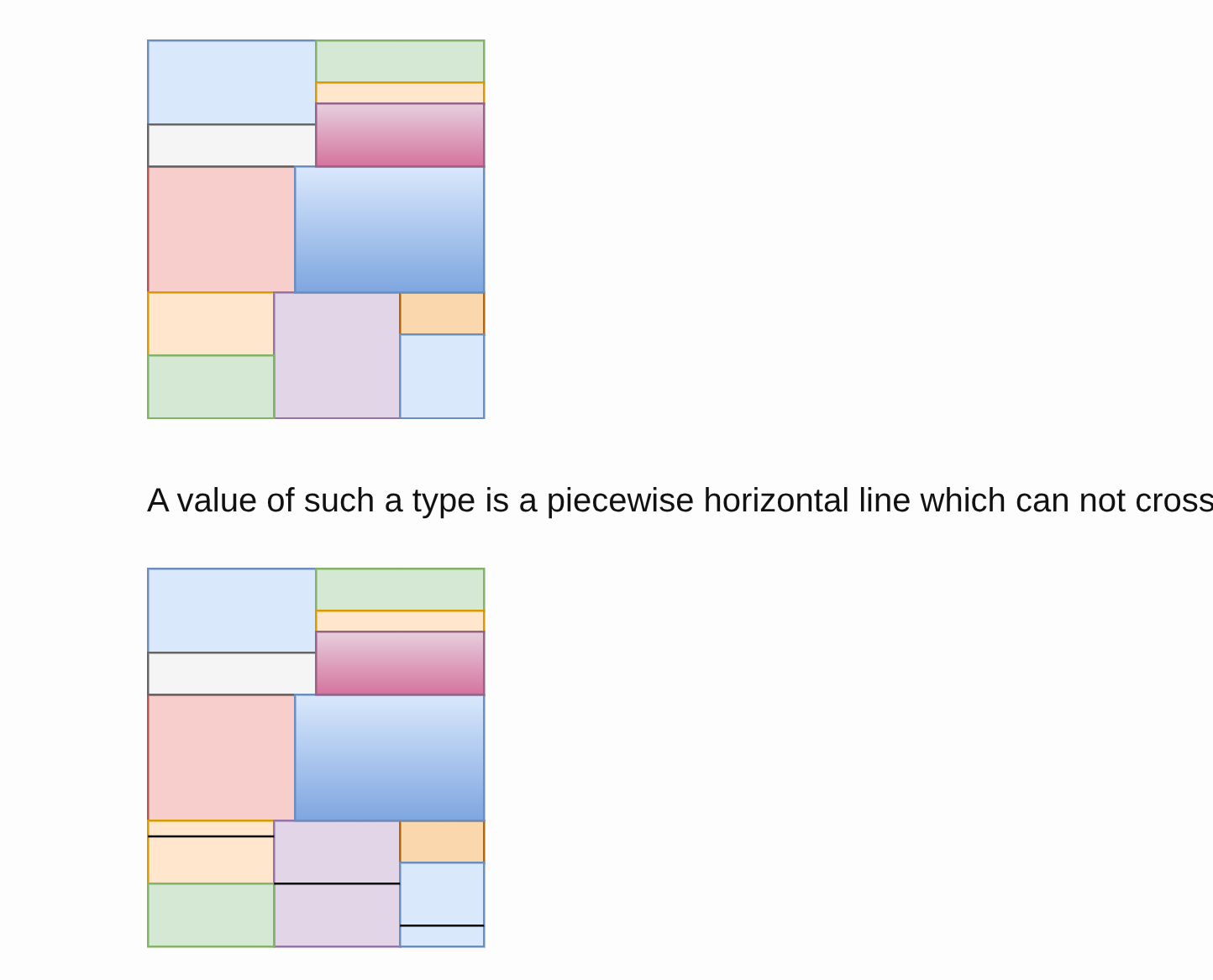
With such a selection we can see that for any value of the outer type
A, we actually have a value of the type identified by the red rectangle, which we will callB.

I’m having difficulty understanding which colour is meant by red here - we have a sort of dark orange-brown, a sort of desaturated maroon, and a pinkish red. My best candidate guess is the orange-brown, which is selected in the bottom third on the left. But I can’t see how A always has a B if it’s that one. I can’t see how A always has a B if B is any of the colours, frankly!
I think the clarity of the post would probably benefit from a bit more contrast in the colours.
I’m sorry about this, but I really don’t know why this is happening. You’re not the only one who reported this to me, btw.
This is what I see on multiple browsers and on mobile
If I check the svg code, I see things like
<rect x="0" y="120" width="60" height="60" fill="#ffe6cc" style="fill: light-dark(rgb(255, 230, 204), rgb(54, 33, 10)); stroke: light-dark(rgb(215, 155, 0), rgb(153, 101, 0));" stroke="#d79b00" pointer-events="all"></rect>
where #ffe6cc and rgb(255, 230, 204) are codes for the yellow you see in the bottom left.
If I have time, I could try to replace all the svg diagrams with images, which should avoid every issue
Doesn’t it say to use rgb(255, 230, 204) when in light mode and rgb(54, 33, 10) when in dark mode? I suppose you want only rgb(255, 230, 204).
ah, that makes sense! I’ll fix it. Thanks!
Oh wow, yeah that looks much nicer!